Primary
HEX
#4600AARGB
70,0,170PANTONE C
Violet CPPANTONE U
2371 UPCMYK Coated
94,100,0,1CMYK Uncoated
91,100,0,3
The OAOA logo is a core brand identity element. It reads OAOA, with the “O” forms rendered as switches—modern, graphic, and subtly technical—reflecting the name off and on again. This section covers the logo system: clearspace, scale, color, placement, backgrounds, sub- and co-branding, social media and app-icon use, plus common misuse to ensure consistent recognition.
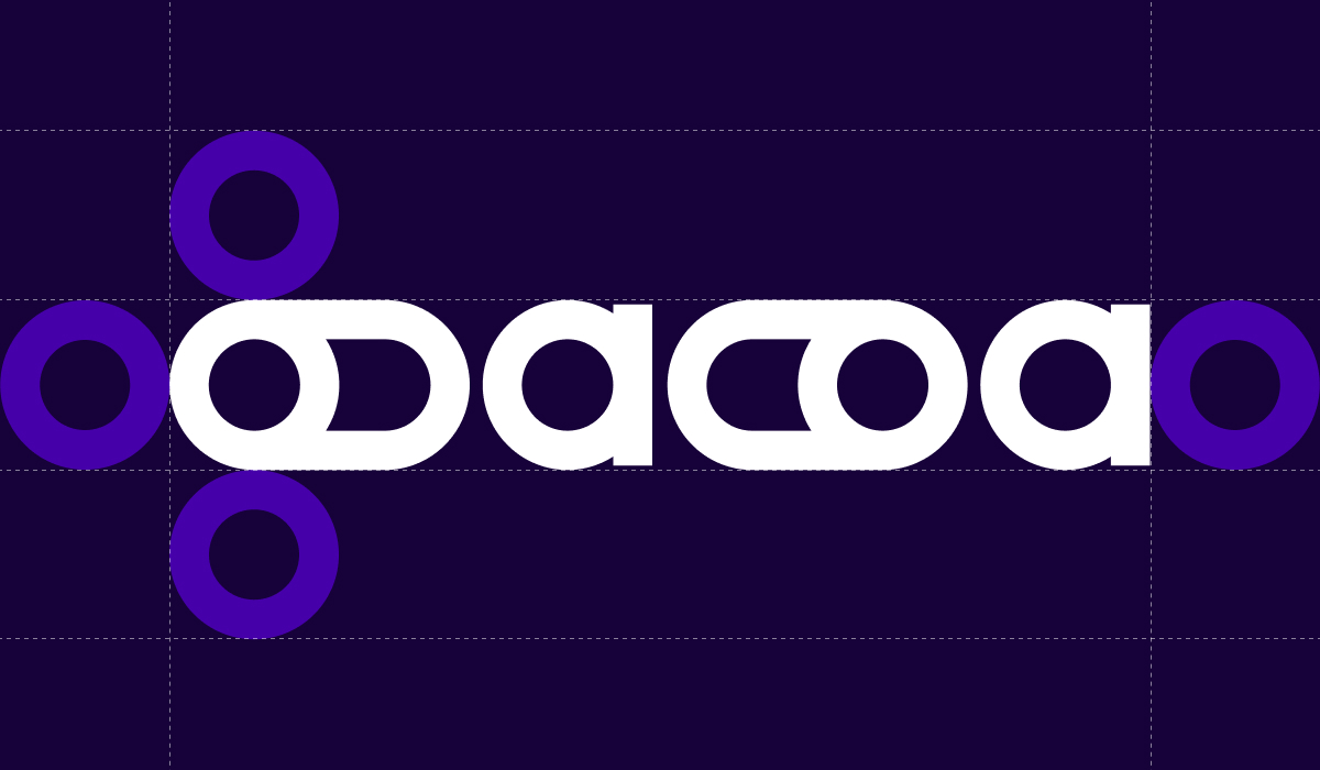
Clearspace defines the minimum area that must remain free around the OAOA logo to preserve clarity and impact. The clearspace is measured using the switch button shape taken from the “O” form: one button unit is placed around all sides of the logo. No text, imagery, or other graphic elements may enter this zone. The clearspace scales proportionally with the logo in every application.
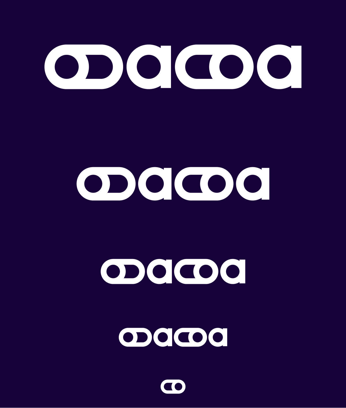
Logo scale ensures legibility across sizes. The full OAOA wordmark is used whenever space allows and remains clearly readable. At very small sizes, the system switches to the standalone icon. The icon is the on-switch element from the logo and serves as the default micro-mark for favicons, app tiles, avatars, and compact UI contexts. The off-switch version is reserved for special, context-driven cases where an intentional “off” state is conceptually required.
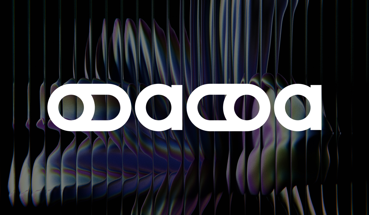
The OAOA logo is available in four core colorways to ensure strong contrast across contexts. Purple is the primary expression and the default choice on light backgrounds. Green is a high-energy secondary variant used selectively for emphasis, launches, or standout moments, typically on dark backgrounds. The dark (new black) version is the neutral option for understated applications and works best on light backgrounds. White is the reverse version for dark fields and imaging. In all cases, the logo must maintain clear contrast to preserve legibility and the crisp switch shapes.
Logo placement follows a clear hierarchy. The full wordmark is positioned prominently in large-format applications and can sit centered or left-aligned when it acts as the main brand anchor. In UI, editorial, or image-based layouts, the logo is placed in the top-left or top-right corner, aligned to the grid and kept within safe margins defined by clearspace. For compact states (e.g., hover, navigation, overlays), the icon replaces the wordmark and occupies the same corner positions. Placement should remain consistent across a series to avoid visual drift and to preserve quick recognition.
Logo backgrounds are chosen to maximize contrast and keep the switch shapes crisp. On light backgrounds, the purple or dark version is preferred. On dark backgrounds, the white or green version is used. When placed on photography or graphic textures, the background must stay visually calm behind the mark, avoiding high-contrast edges or busy detail within the clearspace. If readability drops, a solid color field or subtle overlay is applied before placing the logo.
The logo must not be rotated or angled. Only the upright, original orientation is permitted to preserve recognition.
The logo must not be rearranged, stacked, or split into a new layout. The wordmark and switch forms stay in their fixed structure.
The logo must not be placed with insufficient contrast against its background. Reduced visibility weakens legibility and brand impact.
The logo must not be recolored outside the approved palette. No alternative hues, gradients, or effects are allowed.
The OAOA color system is built to balance clarity, energy, and a distinctly modern-tech feel. It provides a structured palette for brand recognition across digital and print, supports hierarchy in layouts, and ensures accessibility through strong contrast pairs. The system combines a primary foundation for consistency, secondary tones for flexibility, and accent colors for emphasis—applied deliberately to keep the visual language confident, precise, and unmistakably OAOA.
#4600AA70,0,170Violet CP2371 UP94,100,0,191,100,0,3#76F77F118,247,127353 CP352 UP42,0,44,043,0,47,0#EB60F8235,96,248#17023923,2,572765 CP282 UP#F4F4F4244,244,244#FFFFFF255,255,255
Social Media Icon
The SoMe logo uses the standalone on-switch icon for maximum clarity at avatar sizes. It sits centered in a square format and follows the primary palette for strong recognition in feeds and profile grids. For branded social assets and community use, a circular sticker variant is available: the on-switch icon is placed inside a solid field with the “off and on again — oaoa.agency” ring as an optional signature element. Both versions avoid fine detail and preserve high contrast to stay readable in small, compressed platform displays.